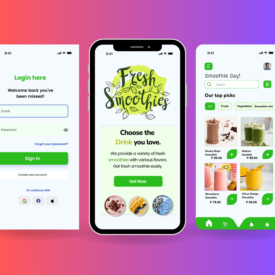
Fresh Smoothies is a vibrant, mobile-first experience made for modern food and beverage brands. Built with clarity, energy, and visual freshness, it delivers a user-friendly flow that moves customers from browsing to craving — in seconds. Whether you're launching a health-focused brand or scaling your smoothie bar’s digital presence, Fresh Smoothies blends playful visuals with purpose-driven functionality to help you connect, convert, and grow.
My Approach
Fresh Smoothies was crafted with user delight and clarity in mind — where every element invites action. From bold headlines to clean CTAs, this design is meant to be quick, intuitive, and visually appetizing. The approach focuses on a balance of friendly tone and clean structure, ensuring the brand feels trustworthy, approachable, and refreshingly modern.
Vision and Innovation
This concept reimagines the way smoothie and beverage brands show up online. Instead of overwhelming users with options, it simplifies their choices. Features like scrollable menus, large tappable buttons, and image-led storytelling enhance mobile usability. The use of vibrant visuals, soft shadows, and clean typography work together to stimulate appetite while reinforcing brand trust.
Identifying Unique Challenges
F&B brands often struggle to make complex product catalogs (like multiple smoothie flavors, sizes, or add-ons) easy to browse on mobile. Fresh Smoothies solves this by prioritizing simplicity, engaging visuals, and hierarchy. It strips away distractions and builds focus on one thing: helping customers choose the drink they love — effortlessly.
Resolving Complex Problems
From seasonal menus to daily specials, the layout is built to scale and stay consistent. The design supports modular content like flavor cards, quick filters, and loyalty rewards. It’s also optimized for responsive behavior — ensuring that whether the user is ordering from a couch or sidewalk, the interface feels natural and fast. Forms, navigation, and CTAs are all placed to reduce friction and encourage action.
User-Centric Design
At the core of Fresh Smoothies is a mobile-first design language. Colors, buttons, and spacing were selected for thumb-friendly usage, fast readability, and visual clarity. The app design is fully accessible, readable in both bright and low light, and adaptable for different screen sizes. The visual rhythm, color psychology, and typography are all geared toward reinforcing wellness, freshness, and action.
Meeting User Needs
This UI is built for startups, juice bars, health cafes, and small business owners in the F&B space. Whether you're showcasing your smoothie flavors, educating users about health benefits, or collecting orders — this design meets the need. It communicates freshness, trust, and ease, while remaining flexible enough for personalization, seasonal updates, or business growth.
Pages Overview
Home – An energetic welcome with bold messaging, featured flavors, and one clear action..
Menu – Scroll-friendly drink options with visual focus and quick tap-to-select options.
About – Brief brand story with highlights on ingredients, sourcing, or wellness promise.
Order Now / CTA Section – Primary action area with easy conversion and clear flow.
Contact – A smooth, mobile-optimized form for feedback, inquiries, or pre-orders.
Loyalty/Promos (optional) – Space for special offers or member perks.
Conclusion
Fresh Smoothies is more than a design — it’s a digital experience tailored for modern, fast-moving brands in the health and beverage space. With intuitive UX, crave-worthy visuals, and clean structure, it helps small businesses build big impact. Whether you're introducing your first product or refreshing your brand, Fresh Smoothies is made to help you grow — one sip at a time.